
“I felt much more like a junior partner with Geof Darrow in most of my collaborations, because his point of view was so distinct that he dominates. It’s like being a wrangler at a rodeo, you’re riding a bucking bronco and the best thing to do is hold on”. – Frank Miller
Context: Due to a bad herniated disk I was flattened out a few weeks ago and asked to stay horizontal for seven days. So with a head full of painkillers and limited mobility I was in a unique state of mind to spend time in Geof Darrow’s hyper brutal and elaborately dense drawings. Hard Boiled was Darrow’s American debut and was released four years after the superhero comic industry was transformed by the darker tones of Frank Miller’s The Dark Knight Returns and Alan Moore’s Watchmen. The work takes its marks from these pillars of comics and further pushes the boundaries and explorations of mature themes and violence in the action adventure genre.


Story: Set in a bleak dystopian future, Hard Boiled operates in a world of excess and depravity reflected down from its heartless corporate domination. One such conglomerate, called Willeford Home Appliances has put into action a paramilitary army to wipe out any opposing corporate values. Not only do they build products for your home, but also build people. Artificial intelligence that look, think and act like normal humans but are secret corporate assassins. Unknowingly, a robot called Nixon is one of them. Completely reconstructed to think he is a regular husband and father called Carl Seltz working as an insurance investigator, Nixon’s fits of rage and faulty programming get scrambled up in a secret robot revolution that finds him at the center of its possible victory.


CARTOONING
Influences and background: One of the deciding factors that separate Darrow with your regular American cartoonist seems to lie in a broad international influence. I don’t know what kind of comic shop was around when Darrow was growing up but it was more expansive than what is usually felt in action comics. Moebius is the obvious towering influence, even to the point that they collaborated together (Darrow drew, Moebius inked) on a series of images called La Cité de Feu (above) now impossible to find and a Holy Grail amongst collectors. Influences of Ku Fu films and Monster movies are also in the mix along with a good dose of Hergé’s sensibilities to form and colour.

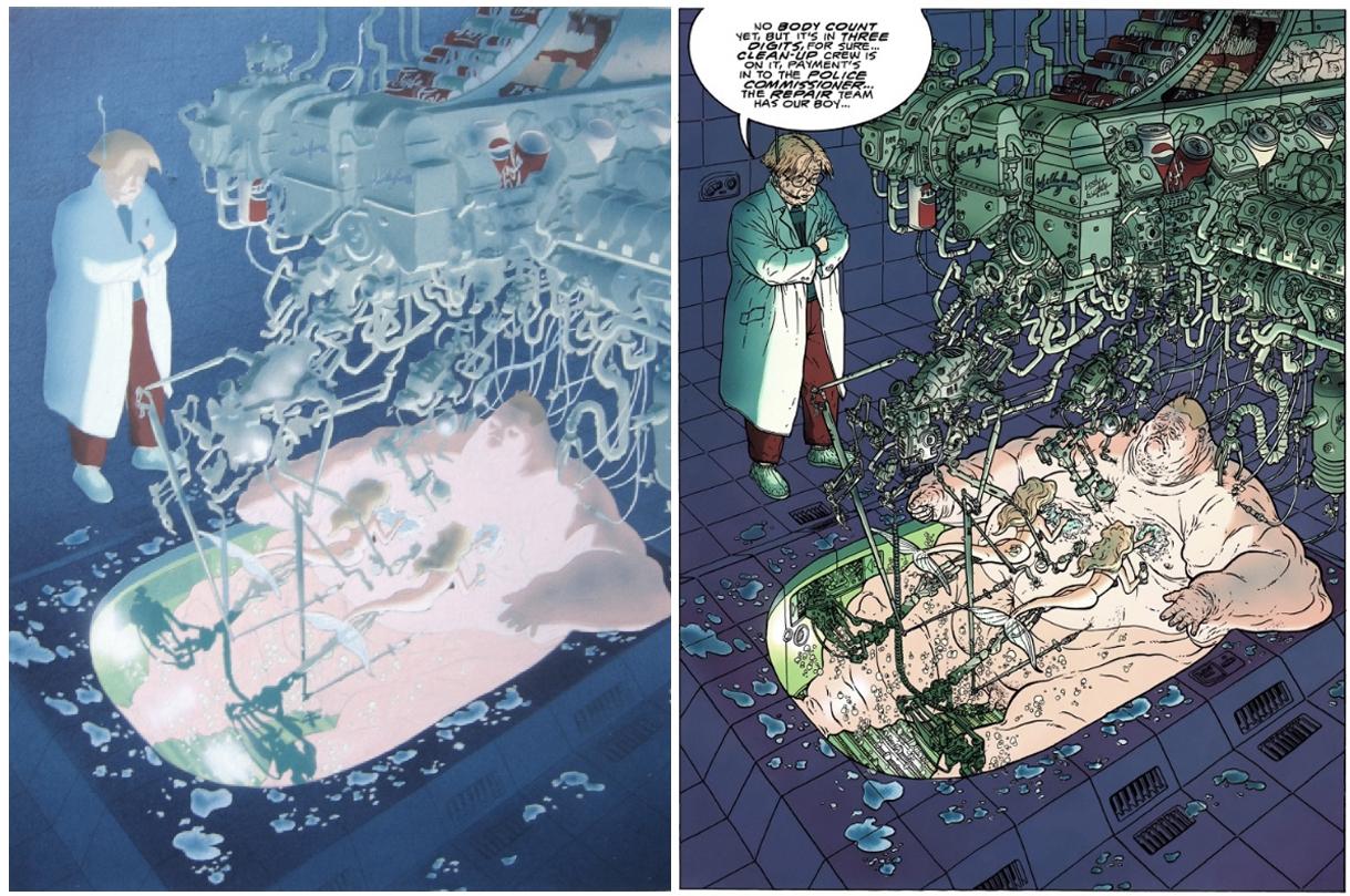
Look and feel: It’s as if Hieronymus Bosch had infiltrated comics – decadence and detail. The kind of astonishment and kick in the gut you get from coming face to face with extended volume and ornamentation. At the heart of Darrow’s art is a fundamental exploration of contrasts: big versus small, many versus one, fast versus slow. This creates an interesting push and pull. Full of action and speeding ahead, the plot of Hard Boiled is intentionally designed to be quick and lean. This encourages a fast reading of story, while the image making knowingly jams the breaks demanding full stops. It’s a musical thing – melodies and rhythms that push the narrative against the pull of the heavy visual bludgeoning. It has a dizzying effect, specially when seen in black and white.

The brutality of it is hard to take in, but the tone and excess of Darrow’s vision really ties in with the story’s overarching theme of corporate culture growing out of control. Logos, product placements and pop culture references like the Flinstones, Astro Boy, Nancy, Porky Pig, Batman, Tweety Bird, Homer Simpson, Ed the Clown, Duran Duran, Hanna Barbera, Popeye, Tintin, Psycho and Bambi are plastered everywhere. Along with Ramones bumper stickers, cars named after Stallone, Eastwood and Norris, highway signs named after Goldie Hawn, giant Pepsi and 7up cans on cars, snickers, butterfingers, Baby Ruth, Milky way, Cheetos – total excess and abundance, the more absurd the better. Although I can’t spot exactly where it is, but Darrow has mentioned in interviews that he even has a battle scene that has one character with a shirt saying Godzilla and the other saying King Kong. It’s a crazy mix.


I recently read cartoonist Daniel Clowes talking about how much attention he’s given to study how folds work when drawing clothes. How it takes time to understand and take under consideration the points of tension and release. Darrow indulges in this and there is something delightful in seeing his folds worked out with such complexity – wrinkle over wrinkle over wrinkle. Interestingly enough Darrow gives as much care and attention to folded fabric as he does to twisting metal. Car after car crashing, folding and intertwining into each other in the same way that Nixon’s trench coat folds and flows when in motion. For a lot of cartoonists drawing cars seems to be a serious problem to tackle and sometimes its avoided altogether … must be something about the geometric shapes of circles and curves in perspective that proves to be tricky – but Darrow is the opposite. Many MANY cars.


It’s slapstick Looney Tunes violence gone ballistic (a man gets his arm ripped off and then stabbed WITH it). Almost to the point of being able to read it as a cyclical commentary of how comics had become plagued with gritty hyper violent stories after the influence of Miller’s late eighties work. It’s almost as if Miller and Darrow are addressing this by going all the way with it as a marker for and end point. You want to play this game, here is as far as it can get pushed in commercial comics – now move on and bring it somewhere new.


Colours: An international comics influence is also apparent in the thinking of its colours. Darrow’s colourist, Claude Legris uses a mix of softer pastel combinations against brighter tones that creates a unique contrast when framing its violent content. And like European comics its size was bigger, the colours more complex and was printed on a heavier stock paper. The entry point to each issue (the covers) where unusually white and minimalistic, offering a sense of design and vision to the whole. These production values really made the book stand out at the time. Even just on the shelf, next to other comics Hard Boiled dominated and bullied its way into your hands.

When looking at the colour work next to the black and white pages it becomes apparent how important the colour is in directing the eye where to go. The original ink work is so dense that the viewer is lost (which is not unpleasant as a curiosity in the deluxe edition) and totally dependent on the colours to come in as a guide, giving focus points to decode its proper pacing and direction.

At times the blasts of colours are blood soaked and bright red, but on some pages – the more extreme ones, the blood is black (below). It reminds me of Scorsese talking about how he had to desaturate the colours at the end of Taxi Driver to avoid an X rating. I’m wondering if there was a call on the publisher to tone it down, which seems a bit odd given what else happens in the book.

WRITING
Frank Miller said that he had to change his whole approach to writing the book when seeing the first three pages from Darrow. So much so that the overall tone had to be completely rethought. The attitude went from being a serious science fiction story to a dark bombastic satire. Miller had to play straight man to Darrow’s visual gymnastics. Look at how this straightforward plot element (main character is chased by police) changes in Darrow’s hands:

Darrow not only draws the police car bigger (big vs. small) but draws it 12 TIMES bigger! Many times in the story Darrow’s art sets up visual jokes that play on the above mentioned big versus small / many versus one / fast versus slow dichotomies. Another one has the main character needing to get passed a series of security men. A trail of bloody agents leads to a full double page spread that has Nixon locked in and surrounded by the enemy along with the battles casualties on the ground. The damage is not just a few dozen injured men but 578. I counted them all.

Miller doesn’t deviate much from standard science fiction themes – artificial intelligence rebelling against humans. But something about its tone does feel refreshing. When trying to readjust to Darrow’s art he says “Finally I happened to write down the words “come and get it you bum” and realized that it was going to be a comedy”. That bleak comedic edge might be what sets it apart – in the original letter pages of the individual issues (fake or not, all funny) they ran angry letters almost exclusively complaining about its violence and lack of morality. Truth is the story itself does seem a bit slim at first, but as previously mentioned the best Darrow story is slender and compact, and here Miller’s trimmed the fat considerably.

Favourite page: (Above) Oddly enough I’m not sure exactly why this is my favourite page other than the look of it feels right. The second issue of Hard Boiled came a few months later and double the size of the first. In my copy, because of the staples and binding design it always folded open at this spread. It was the first issue I bought and always the first thing I saw when I picked it up. It’s not really about the dialogue plot point or action sequence, but more about how the tone of the colours homogenize the page as a thrilling piece of design.

Favourite panel: (above) For me the dread of the whole thing is summed up in this one image. It’s all a sham and Dorothy can’t go back home anymore. Not smart enough to notice his part in a possible robot revolution, Nixon’s finally cornered and given a last chance. “You take the blue pill, the story ends. You wake up in your bed and believe whatever you want. You take the red pill, you stay in Wonderland, and see how deep the rabbit hole goes.” Not a fan of Lewis Carol, Nixon gets to keep working in the insurance business – happy ending and all.


Fun Fact: Miller says he used Darrow’s likeness as the template for Sin City’s flesh eating murderer in the first book in the series called The Hard Goodbye.

Brag: I own the original to your first image, “Normal Guy.” Traded it for a Concrete cover with Geof — who is, incidentally, conversationally brilliant, self-deprecatingly funny, and a mesmerizing storyteller in person.
Hard Boiled was an incredible book, wasn’t it? At one point in the late nineties or early oughts Nicholas Cage was interested in starring in a film version. Too bad it didn’t happen then. Still might, of course…
Geof seems like a really sweet guy, and an incredible talent. I guess the perk of being great cartoonists is being able to trade your work like that. I would love to see that original page, is it just pencils or fully inked? A filmed version, in the right hands could have been incredible – but at the end of the day I guess I’m happy with the comic being the definitive version with nothing else to distract from it.
Unit Two, disguised as an old woman, wears a sweater with a picture of a dog. The word “Godzilla” is written above it in Japanese Katakana.
After destroying Unit Two, Carl steals clothes to disguise his injuries, and boards a subway. He is now wearing a sweatshirt with the word “King Kong” also written in Japanese Katakana.
The two shirts do not appear in panel together.